
After one of the last co-design sessions, a number of changes had to be made. During the session it immediately became clear that the case owner preferred placing the spice containers horizontally on the rack, instead of magnetically snapping them to the back wall. Ted felt that in this way the spices were less likely to fall out when he would bump into the rack or a wind gust came by. With this change, the angle of the shelves needed to be adjusted as well. This leads to two possibilities, the shelves in this case could be either angled or placed horizontally. The choice fell over the second option, since the original idea for ¡Spice was to create a design accessible to both blind and sighted users. In fact, by placing the containers on a horizontal shelf, it would make it difficult to recognise the spice since it is ‘hidden’ inside the compartment, and the design would go against its purpose.
Size-wise, the prototype was already in line with the expectations of the case owner. They did mention however that they would like the holes of the rack to be made a bit wider, so that it would be easier to take out the spice containers.
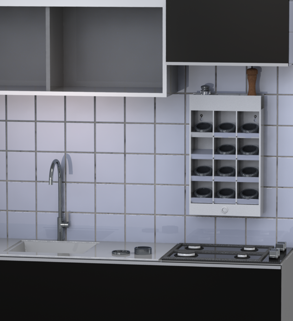
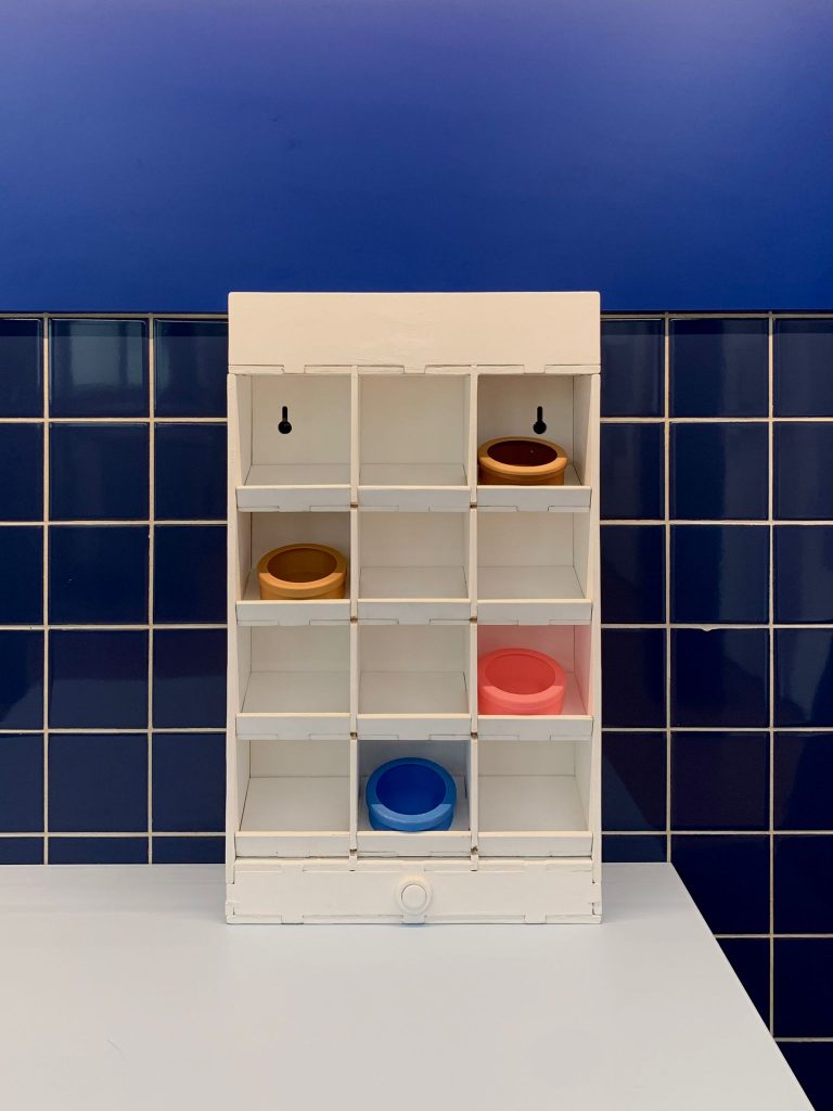
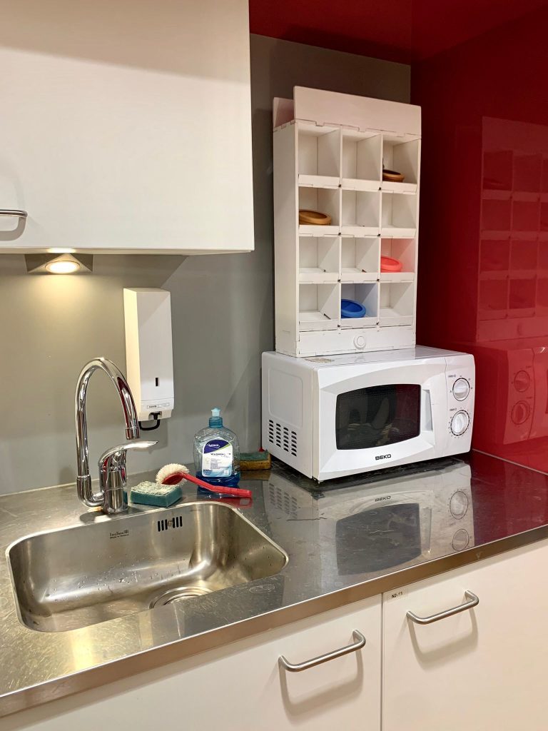
Furthermore, when looking at where in the kitchen the rack would be placed, the most optimal placement was on a specific wall, with a relatively small width, leading to some changes in terms of dimensions, in this case rows and columns where interchanged leading to a prototype with four rows (1, 2, 3 & 4) and three columns (A, B & C), this was not a drastic change to the ¡Spice design.
In order to take away some of the space from the sides, the electronic compartment, initially placed on the right side of the prototype, was moved to the bottom of the prototype. As a consequence the two buttons to turn on the system were now, following Ted’s instructions, minimised to one and placed towards the bottom of prototype as well. In the original mid-fidelity-prototype the button was placed on the right side of the ¡Spice, spice rack, however this would not allow the rack to be placed against a wall or cabinet on its right side. Following this logic the bottom and top of the rack were also no option, since the button would always count as ‘extra space’ or malfunction of the design. As a consequence the bottom-front of the prototype.
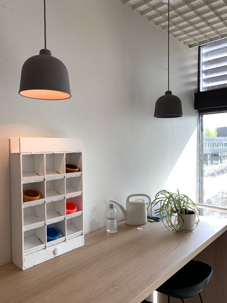
As previously mentioned Ted is fond of his wife’s advice when it comes to colours or style, for this reason following her instructions, the spice rack shall have a neutral colour, like white, that could easily fit with the kitchen’s design. Furthermore, under the wife’s suggestion, it was mentioned how the rack could be better if made with a lacquer paint. In fact, since the spice rack would be placed in a kitchen, the lacquer paint would be easier to grease off, when cleaning the shelves.
Furthermore, the choice was made to make the shelves removable, this makes it easier to clean and get in all the nooks and crannies. Additionally, this design choice makes it possible for blind people to clean, because it could be done more systematically by taking each shelf and cleaning it under the water. By doing so the case owner won’t have to rely on visual feedback while cleaning. Lastly spacers and ridges were added, spacers to the additional space at the top of the spice rack and ridges to all the now angled compartments, so that the containers are unable to slide or fall out of the rack.
The final prototype
For the creation of the final prototype, the idea was to create a 1:1 model out of work which would be painted afterwards. The prototype is made out of 6 & 8mm plywood. In order to give the structure strength, the outside surrounding layer is made out of 8mm thick plywood, while the inside parts are made out of 6mm plywood to ensure a relatively lightweight structure.
The full prototype was first created in Solidworks and then laser cut. The theory behind the creation of the laser-cut design was inspired by the classic laser-cut-boxes, but with a higher complexity for the prototype design due to the number of components.
Because of the laser cutting, all panels had sharp edges. These were sanded down to be rounded and user friendly for visually impaired.
Furthermore, all parts have been painted with multiple layers of white acrylic paint. As this kind of paint leaves quite a rough surface, sandpaper was used to ensure a smooth finish on all of the parts. Following, all the structural parts were stuck together, and some other glued together with wood glue. The only exception is for the shelves, which are locked in place by design and can be easily taken out to be cleaned. Finally, the button at the bottom of the structure makes use of a spring system to feel ‘fully-functioning’.
Overall, the design of the prototype reflects both the group’s original vision as well as the case owner’s one.