
Throughout the month following phase 1, there were several changes in direction, which required the group to revisit the ideation process multiple times. The first direction suggested was strictly related to running and its problematics, leading to a deep exploration during the ideation phase. However, shortly after the meeting, Ted changed his mind, proposing a shift towards the massage salon and its organisation. This led to another ideation session, culminating in the development of a questionnaire. Yet, during one of the latest meetings in phase 2, Ted once again suggested changing direction, expressing a preference for something related to the kitchen. In order to mitigate further changes in the midst of the project, the decision was made to finalise the idea into a spice organiser. Of course, this led to some challenges in maintaining a linear progression and ultimately resulted in the postponement of a physical co-design session.
Previous ideations and development of ideas
Challenges of running and orienting
The first meeting with the case owner showed the presence of three main challenges. Those fell into the following categories: reading treadmill statistics, running independently while still avoiding collision with people or objects and finally orienting or finding objects around his own house.
Reading treadmill statistics could be easily solved by creating a text-to-speech system or creating a secondary device capable of communicating with the user in order to communicate its status while running.
For what concerns finding objects or orienting in his own home multiple solutions were discussed. In this case, the most promising solution is related to ‘RFID scanners and tags’ being able to individuate the location of certain objects around the house via an app or sound-activated sensors that could be used to find objects.
Since the team was originally looking for more of a ‘challenge’ the main focus was given to running and its obstacles. In this case, multiple points of view were analysed. For this reason, the group followed three concepts directions namely: running sensors capable of distinguishing between and reacting to approaching obstacles or dangers, running track designs to be implemented in parks, public areas and marathons for the use of blind runners and finally a dog leash and harness design in order to run with his guide dog rather than by needing a buddy. However, even though Ted seemed fond of most of those ideas, he suggested switching focus to his massage parlour.
Massage parlour
During the following meeting with the case owner, it was suggested to switch the group’s focus to massage therapy at the parlour. For this reason, a second ideation and research phase took place. In this case, Ted expressed his frustration in finding products, especially in the context of a session with a client, Ted explained that the sequence that he and his wife use during the therapy is different, which leads to an incongruity in positioning the bottles of products which might get mixed up in the process.
To try and solve this problem and number of concept directions were taken into consideration: an organiser for products differentiated for him and his wife, an automated system capable of ‘handing’ the correct product depending on the therapy and order of products, a new massage bed with multipurpose compartments and storage for products and towels.
For this second ideation, the focus was to create a system that would not disturb the massage session and allow a relaxed and calm environment. For this reason, no system should make use of sound nor vibration cues since they could influence the session atmosphere. However, Ted once again suggested changing direction, expressing a preference for something related to the kitchen.
Final concept direction
The latest meeting with Ted another change in direction was suggested. In this case Ted expressed the need to find order into his daily life, as he later on explained, due to his vision he struggles to find and distinguish objects around the house. A clear expression of this struggle can be found in his kitchen where he deeply struggles in identifying spices.
In this case a fast look at the kitchen’s cupboard cleared all of the group’s doubts. Spices are kept inside a plastic box, each in their own container, which due to branding is often identical. Ted has to open and sniff each container in order to find the correct spice. This process is not only extremely time consuming but is also impossible with a stuffy nose.
In order to answer those needs a new ideation phase began.
Furthermore, after this meeting, the group utilised Ted’s experience to compile a checklist of essential features to consider when designing the new spice organiser. The criterias included accessibility, usability, organisation, navigation, safety, and integration of new technologies.
This is a list of the criteria used for the first ideation:
- Easy-to-reach shelves or compartments that can be navigated effortlessly by someone with visual impairment.
- Tactile markers or labels on each spice container to allow for easy identification through touch or braille.
- Function taking a higher importance than form, for accessibility purposes, so minimalistic controls and clear indicators are essential.
- Number of controls to operate the product, for accessibility & usability purposes.
- Logical and intuitive organisation system for the spices, such as alphabetical order or grouping by cuisine.
- Usability for both sighted and visually impaired users, for inclusivity purposes, therefore auditory or tactile cues to assist the co-designer in locating specific spices within the rack and visual cues for accessibility.
- Visual appeal, durable materials and sturdy construction to withstand daily use and potential accidental bumps or collisions.
- Safety features, such as rounded edges and non-slip surfaces, to mitigate the risk of accidents or injuries.
- Compatibility with existing assistive technology, such as voice control and screen readers, for accessibility and integration of new technologies. (smart sensors or mobile applications), to provide real-time assistance in identifying and managing spice inventory. (Ensure seamless integration into his daily routines).
(Henkler, 2020)
The following are the results of the multiple ideation sessions. The following are the most promising directions that were identified by the group.
It is interesting to notice how most of the designs seem to have a common ground in terms of design choices, this was probably determined by the creation of criteria before the beginning of the design process.
Quantitative ideation
The first part of the ideation was strongly based on the criteria set by the team. In this case the aim was to understand the best possible shapes and solutions that could easily answer the needs and behaviour of the case owner.
The idea for this phase was to work on shapes that could be easily recognised by the user. In this case the main focus fell on the shapes of the containers where more ergonomic shapes were used in order to provide some tactile cues thanks to the ‘redirections’ given by the container shapes. The group quickly realised that common spice containers might not be the perfect option for blind users. It was in fact discovered that visually impaired users tend to measure spices with the use of their hands, by, for example, measuring herbs by pinching them or using the palm of their hands. This consideration was kept in mind for the creation of possible containers.
Another very strong point goes with relation to the organisation of the space. In fact, Ted explicitly mentioned how he usually prefers simplistic designs since it makes it easier for him to get mis-leaded by pompous or complex designs which are usually thought for the use of sighted individuals. For this reason, the concentration of the team fell on more ‘grid-based-designs’ or simple and intuitive designs.

Qualitative ideation
After a thorough analysis of the qualitative ideation, it was clear the group was following different directions that still had a common ground. The ideas with the most potential were further developed and analysed with the group to find possible points of improvements. The ideas with the most potential from this collection were deemed to be the following:
Between those ideas some stood out in terms of functionality as well as simplicity and intuitiveness. Ideas and line of thought were discussed with the case owner in order to include him throughout the ideation process. The outcome of this integration between the team and the case-owner lead to the choice of two very different concepts that would have to be fully evaluated in concordance with the group’s requirements list.
Requirements
Based on the criteria previously selected, a list of requirements was created. This list will serve as a basis for the conceptualisation, and will be used to examine whether the product has met its goals.
| Nº | Requirement | Explanation |
| Basic needs | ||
| 1.1. | The product shall have a minimal aesthetic, as to prioritise functionality over aesthetics. | In communication with the case owner, it was mentioned that the aesthetics do not matter to the case owner personally, and that functionality is the driving factor. |
| 1.2. | The product shall take no more than 3 steps to operate. | For accessibility reasons, the product should be as intuitive and simplistic as possible. This also came back in communication with the case owner, who mentioned that any “bells and whistles” only detract from the quality of the product. |
| 1.3. | The product shall have softened edges. | For safety purposes, the product should have no sharp edges. |
| 1.4. | The product shall provide non-visual feedback through audio and tactile cues. | For visually impaired people, feedback must be provided in a way that is understandable to them. |
| 1.5. | The product shall aid the user in finding the positions of specific spices. | This is the core function that was decided on with the case owner. For the case owner, this criterion specifically centres around the organisation of spices, but is here generalised for inclusivity. |
| 1.6. | The product shall store at least 10 types of spices. | Users should be able to store at least their more commonly used spices. |
| 1.7. | Each spice container shall have a volume of at least 100 mL. | The containers should have an adequate size, as to not have to refill the containers quickly. |
| Satisfactory needs | ||
| 2.1. | The product shall be usable for both the visually impaired and the fully sighted. | Inclusivity should be kept in mind for the product. |
| 2.2. | The product shall use non-braille methods of tactile feedback. | Because the case owner was not born blind, they take longer to convert braille to words. They understand it, but would prefer not to use it. |
| 2.3. | The product’s size shall not exceed 440x750x150mm. | This is the space that is available in the location specified by the case owner. This is also a size that will not be too large for most kitchens. |
| 2.4. | The product shall be able to resist a force of at least 150N. | The product must be sturdy and rigid to prevent breakage, considering the potential for drops or accidents. |
| 2.5. | The product shall be cleanable within 5 minutes. | In a kitchen space the product will probably get dirty fairly quickly. Hence it should be easy to clean. |
| 2.6. | The product shall have an internal energy source that is easily rechargeable. | This allows the product to not be reliant on wall plugs, allowing more versatility in product placement. |
| 2.7. | The product shall have a modern aesthetic and be visually appealing to at least 7/10 people. | In communication with the case owner, it was mentioned that the product’s functionality should not diminish its visuals. The case owner mentioned that people around them still have to be content with the product’s visuals. |
| Excitement needs | ||
| 3.1. | The product shall have compatibility with existing assistive technology like Google Assistant. | Options like these will improve both convenience and accessibility. |
| 3.2. | The product shall offer customisability, allowing users to change things like the voice for audio cues, the volume of the audio. | Users should have control over how they would like their interaction with the product to be experienced. |
| 3.3. | The product shall function with both custom and market standard spice containers. | This allows for the most used spices or spices that are difficult to transfer to different containers to still be usable within the product. |
Concepts
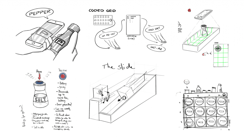
After a thorough analysis of the ideas generated during the second ideation two concepts stood out, namely ¡Spice and Topp¡e. Both the concepts come from the preference of the case owner to process vocal cues rather than tactile ones related to braille or vibrations, at the same time both ideas can be helpful for a larger group of individuals even if not visually impaired.
From the ideation and the requirements, 2 final concepts were created:
Topp¡e
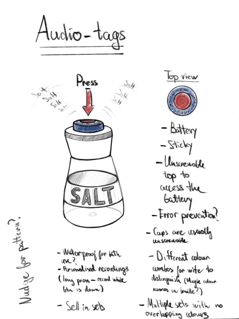
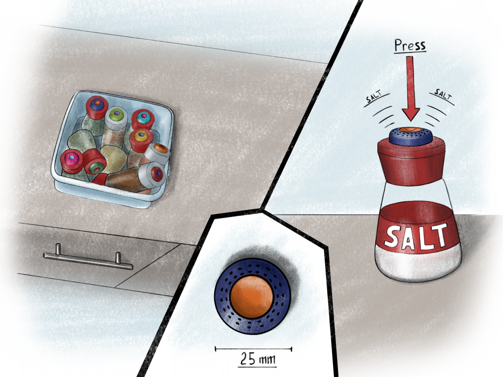
The second concept is Topp¡e, a voice control button that allows users to save a voice memo. When the button is pressed, it will then play this voice memo. For example, if the user uses a Topp¡e button for their rosemary bottle, they save the memo “Rosemary”, and when the button is pressed, it will tell the user that the product that they have is rosemary. A large advantage of this concept is that it is not limited to use for spices, and can also be used for other products (e.g., shampoo & conditioner, different remotes).
¡Spice
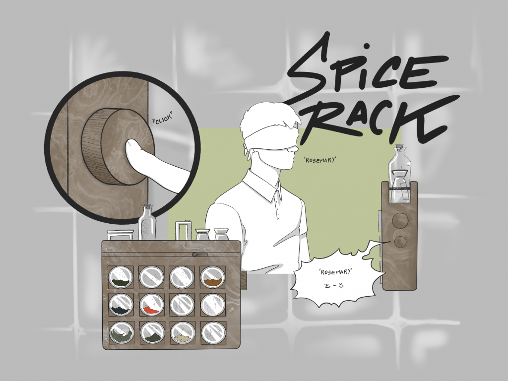
The first concept is called ¡Spice and it consists of an accessible spice rack for the use of both blind and sighted users. The idea behind ¡Spice is to have a system that ‘reminds’ the location of certain spices for you. The smart system of ¡Spice gets activated by pressing a button on the side of the spice rack. By doing so the user will only need to name out loud the spice they are looking for and the system will answer back with the location of the specific container. The answer will be synthetic and will direct the user towards a column (letter) and a row (number). Extra space can be created at the top of the rack.
Concept evaluation
In the table below, both concepts are rated on the requirements on a 1-5 scale, with:
- Does not meet the requirement.
- Meets only part of the requirement.
- Barely meets the requirement
- Mostly meets the requirement.
- Fully meets the requirement.
If the concept is more so a yes/no answer, the rating will be ‘Y’ (yes) or ‘N’ (no). If a requirement isn’t applicable to a concept (for any reason imaginable), it will be rated ‘N/A’ (not applicable). This does not mean it is a bad rating, it means it is dependent on external factors. If the requirement cannot be tested, but would hypothetically be the case, it will be given a rating of ‘H’ (hypothetical).
| Nº | Requirements | ¡Spice | Topp¡e |
| Basic needs | |||
| 1.1. | The product shall have a minimal aesthetic, as to prioritise functionality over aesthetics. | Y | Y |
| 1.2. | The product shall take no more than 3 steps to operate. | 4 (Will only take more than 3 steps if the saving process goes wrong or the input sentences are invalid. | 5 |
| 1.3. | The product shall have softened edges. | 5 | 5 |
| 1.4. | The product shall provide non-visual feedback through audio and tactile cues. | 5 | 5 |
| 1.5. | The product shall aid the user in finding the positions of specific spices. | 5 | 3 (Does not inherently help with finding. Mostly used for distinguishing. Requires extra functionality, such as an app, to improve finding.) |
| 1.6. | The product shall store at least 10 types of spices. | 5 | 5 (Not exactly applicable, but can use 10 Toppie buttons) |
| 1.7. | Each spice container shall have a volume of at least 100 mL. | 5 | N/A (Makes use of store-bought spice bottles. |
| Satisfactory needs | |||
| 2.1. | The product shall have a modern aesthetic and be visually appealing to at least 7/10 people. | Y | Y |
| 2.2. | The product shall be usable for both the visually impaired and the fully sighted. | 5 | 5 |
| 2.3. | The product shall be able to resist a force of at least 150N. | H | H |
| 2.4. | The product’s size shall not exceed 440x750x150mm. | Y | Y |
| 2.5. | The product shall be cleanable within 5 minutes. | Y | Y |
| 2.6. | The product shall have an internal energy source that is easily rechargeable. | Y | Y |
| Excitement needs | |||
| 3.1. | The product shall have compatibility with existing assistive technology like Google Assistant. | H | H |
| 3.2. | The product shall offer customisability, allowing users to change things like the voice for audio cues, the volume of the audio. | H | H |
| 3.3. | The product shall function with both custom and market standard spice containers. | Y | Y (Specifically uses market standard spice containers). |
From this, it can be seen that, although both concepts (mostly) fit the bill for a feasible product, ¡Spice is rated slightly better. Communication with the case owner confirmed the expectation that this product would be better suited, and it became clear that ¡Spice was the preferred concept.
It is also to consider that the Topp¡e design was thought for a wider set of objects, its added value consisted in being an optimal solution for multiple objects around the house. Unfortunately, Topp¡e’s design didn’t fully meet the needed requirements for the kitchen use. In fact, the user would still need to go through a number of the containers before finding the correct one. This could go against the whole purpose of the ideal final design. Additionally, Ted’s opinion was determinant for the choice of the final design. He agreed with the team’s concerns and the final concept was set to be ¡Spice.
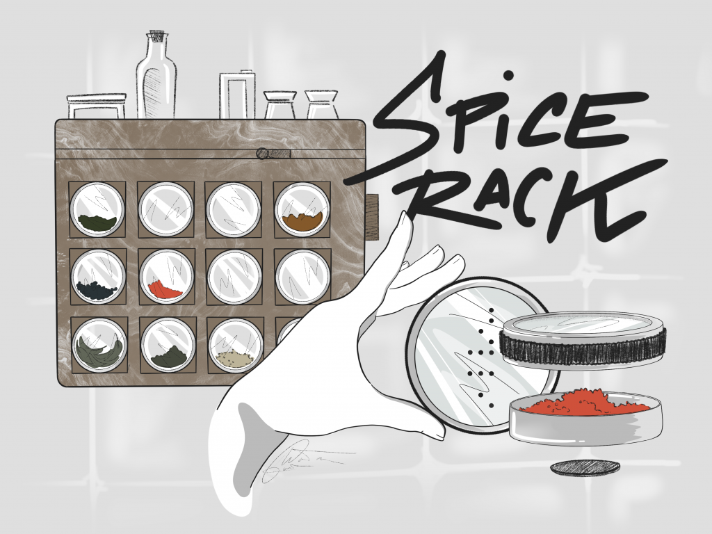
¡Spice
The ¡Spice comes from the combination of a number of ideas. The main aim of the design is to easily recognize the location of a specific spice that is to audio cues given by a ‘Smart software’ installed in a technical box. ¡Spice ‘reminds the location of the spice for you’.
¡Spice makes use of three main elements: the spice rack per-se, the containers and the smart software.
The spice rack is designed to be easily navigated by visually impaired users and applies the theory of the ‘battleship’ game to create an ordered checkerboard pattern. The ‘board’ is composed of three rows defined by the numbers 1, 2 & 3 and four columns defined by the letters A, B, C & D, creating a total of 12 possible cross-points, each representing a container and therefore a spice.
The ¡Spice, spice rack, also, takes into account possible extra containers, spices or condiments that for a particular reason cannot be transferred into a new container. For this reason, a secondary organiser is placed at the top of the structure allowing freedom of use to the case owner.

Another small addition to the design is the inclusion of a small dosing spoon placed parallel to a small recess, following a horizontal line right on top of the top row. The recess, used as a tactile cue, helps the blind user in identifying the location of the spoon. The spoon design could resemble an ice cream scoop by creating a simple ‘level’ system to allow an even amount of spice per scoop. The creation of the scoop design is strictly related to the way blind individuals measure spices with their hands; this could in fact result in a problem if a spicy spice is used. In this case the spoon would avoid this occurrence.
How are those elements applied in the ¡Spice design? The ¡Spice rack shall have a button on the side of the structure. Once pressed the ¡Spice activates and listens to the request “Find Rosemary”, processes the data and answers back with the exact location of the spice container, (eg.) “Rosemary in A-2”. For what previously described ¡Spice uses a ‘triple check’ system: it first doubles check the given command by repeating the name of the spice, which can be ‘triple checked’ by reading the braille name on the container. After those steps, the system automatically turns off.
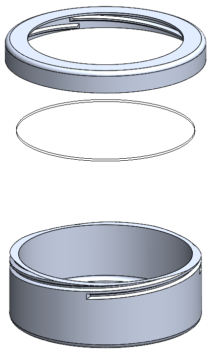
The ¡Spice, spice rack, makes use of a number of identical metallic containers, whose shape reminds of short cylinders with a transparent top. The bottom of the container has a ‘built-in’ magnet which is used to allow a secure erect position in the spice rack. The screw cap leaves a major area transparent; this design solution is motivated by the choice of making this spice rack accessible not only for blind users but also for sighted individuals. The transparent area has a double function: from one side allows sighted users to view the content of the spice contain, on the other hand in creates the perfect area on which to write the name of the spice with both a marker/uni posca or a braille labeller (which can be easily substituted by 3D paint dots in absence of a labeller).
In order to insert a new spice or change the location of an already ‘registered’ item the plan would be to include a second button to keep pressed while changing the saved location or adding a new one. Maybe through a setting “Add location” or “Change location” that could be reprogrammed through voice control.
Software
Ideal solution for the Spice Rack
The ideal solution for the software of the spice rack would be to have it implemented within the spice rack itself, so having a computer that allows for Text-To-Speech (TTS) and audio feedback. To save a new spice container or change a container’s position, the user presses the button and calls out the name of the spice and the grid position in which it should be saved. This will save the spice to that specific grid position. To recall the location of a spice, the user presses the button on the rack and calls out the name of the spice. The rack will then provide a speech prompt with the location of the spice.
An addition to this system would be to digitally tag all spice containers, such as with an RFID or NFC tag. When placed within the spice rack, the rack would automatically save its location based on the grid position and a corresponding tag reader within every slot. A downside of this is that the RFID/NFC tags would have to be reprogrammed to alter the contents of a container, as likely not all types of spices will have their own tag. This is significantly more advanced than manually saving the positions of spices.
Solution for ¡Spice concept
As the hardware and software for TTS-modules are expensive and difficult to program, the decision was made to simulate this function using existing TTS software and audio feedback systems, using other electronic devices, such as laptops or phones. From this, the insight to use the TTS and memory functions of Google Assistant came up. This function proved difficult to use, however, as the remembering function was found to be highly unreliable, and queries would not be recalled properly. The choice was made to move to a program called Dialogflow. Dialogflow can be fed with intents, basically functions, and entities, more commonly described as variables. These intents are fed training sentences, which allow the program to associate similar queries with the original phrases. This makes it a lot more fool-proof than a self-coded input. From Dialogflow’s input queries, the entities can be extracted and outputted into an external database. As for the database, Google Spreadsheets was used in combination with Google Apps Script, allowing for programming within Google Spreadsheets. When the variables are sent to Apps Script, they are, depending on the function, either saved to a particular position, corresponding to its grid position, or recalled, from the grid position they are in. However, the link between Dialogflow and Google Spreadsheet cannot be done properly without the use of Google Cloud Functions. This is a service that is paywalled, thus the decision was made not to connect the two. This means that the functionality of the prototype is for now theoretical. However, both the front end, user communication with Dialogflow, and the back end, the Spreadsheets database, work in practice, so it is safe to assume the prototype would be fully functional using Google Cloud.
Co-design sessions
Throughout the project multiple techniques of co-designing were used. The visual impairment of the case owner led to two separate approaches for the co-design sessions. From one side the group used the technique of descriptive co-design, from which later gathered information from the feedback received throughout the meeting. The group paid meticulous attention to all details and comments of the case owner in order to apply his wishes as much as possible on the final design. From the other side physical mid-fidelity-prototypes become extremely handy when analysing the experience of the case owner while interacting with the designs.
The first approach was used especially during the first few sessions. In this case the design was presented in a descriptive manner, so that the case owner could create a mental image and give feedback based on the team’s description. On top of the descriptive presentations of conceptions, direct questions were asked. This iterative process enabled the group to quickly identify and address usability issues, refine design elements, and ensure that the final product meets the needs of the blind user effectively. Additionally, it helped the group members in leading the conversation and receiving concrete and constructive feedback from the case owners, as well as helping Ted in making choices and changes for the final ¡Spice design.
This technique was applied due to the request of the case owner to spend a minimum amount of time on the project and simply the decisions of the team. So, to get the case owners genuine opinion these direct questions were used.
The second co-design approach was conducted by going to the case owner’s home with a medium-fidelity prototype, to get him to feel the design and use the prototype to test the user interactions in order to receive feedback on what they liked or would like to see changed. During the co-design session, the co-designer interacted with the prototype, providing feedback on its usability and accessibility, and by suggesting improvements or modifications. This iterative process allowed the group to make rapid adjustments and improvements to the design in response to user input.
In one of the last co-design sessions Ted and the team worked with a mid-fidelity prototype. Before the co-design session, the group made a real-size cardboard prototype. Making the prototype on a 1:1 scale, this would help the case owner to interact with the prototype without considering that some parts would be larger in the end.
For the co-design session, a delegation of the group travelled to the case owner’s house to test the prototype. Some factors that the group were especially interested in were the general sizes of the spice rack and spice containers, the layout of the slots and buttons, and the usage of braille, for instance. The co-design sessions went smoothly, and the group got valuable insights into how to improve the product. Some things that the case owner mentioned were that the spice containers should lay down in the rack, instead of magnetically snap to the backside of the rack. Another aspect that was mentioned was the rack should be easily disassemblable. This would be of importance, as the rack may get dirty, because it would hang in a kitchen, probably near the stove.