
To get to a satisfactory solution to this project it is important that both the wishes of the case owners and our project group are met. This can be achieved by a good understanding and implementation of co-design methods. The majority of co-design methods are created for people that have no disability to their vision. Due to this we had to closely examine which methods are fitting in our specific case and context in order to properly ideate and make suitable concepts.
After the first meeting with the case owners, a lot of ideas came to our minds. We had multiple brainstorming sessions that led to more specific ideas forming our concepts that we would present to the case owners for the co-design session. The next 3 paragraphs describe our 3 chosen concepts.
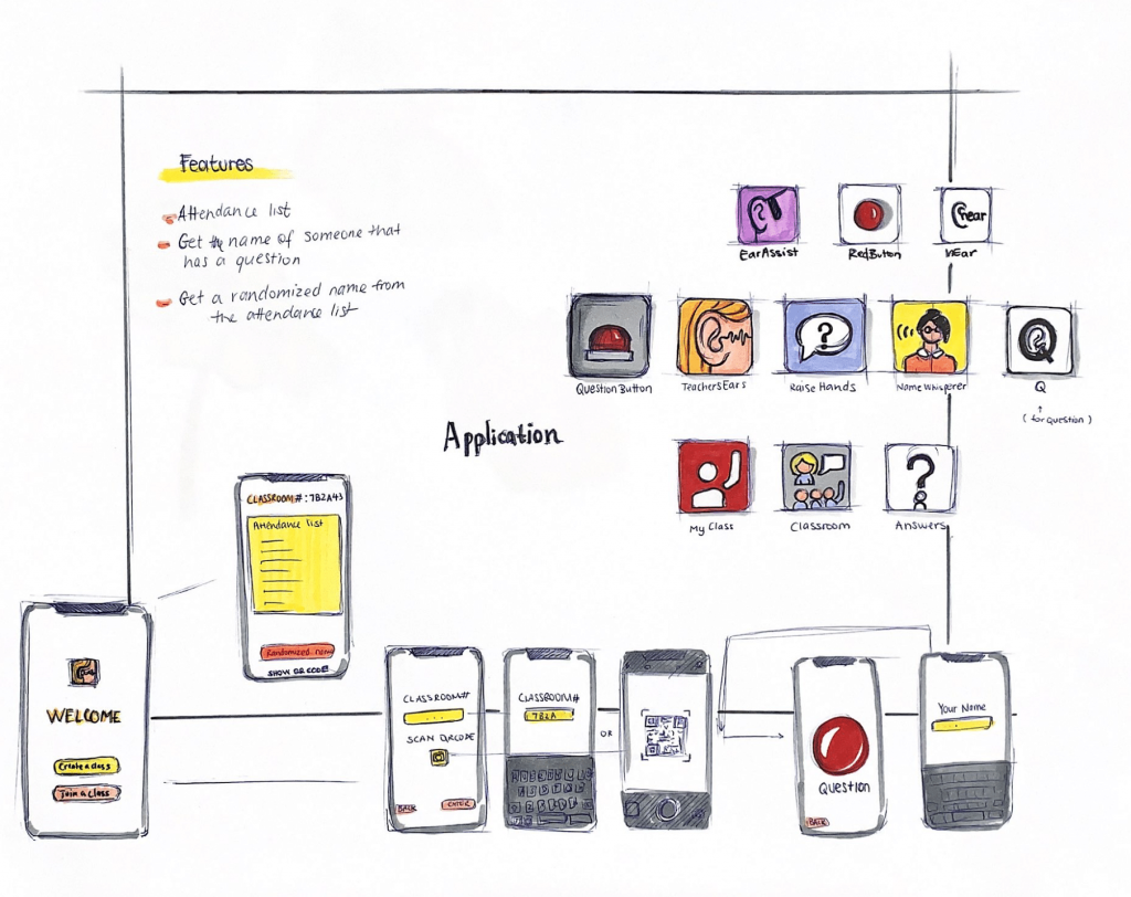
Box + keychain: Every student will receive a keychain with an NFC chip in it. The keychain is personalized per student. There will be several NFC readers distributed across the classroom, e.g., one per row of tables. If a student has a question the student will tag the NFC chip on the reader, and the name of the student will now be shown on the screen of the teacher. The student then raises his/her hand to show where he/she is sitting. The keychains can also be used to keep attendance if the students tag in at the start of the lesson.
Phone as NFC: Similar to the Box + keychain idea but the students would have to use their phone as the NFC tag.
The App consists of a teacher side and student side:
Being able to have multiple buttons is a function we considered. For example, a button with “I have a question”, a button with “It is going too fast”, a button with “I don’t understand”. In this case, once the button “I have a question” is clicked the name will pop up and the other buttons will appear in a graph to show the overview of who understands and who does not.
Lasty, considering having multiple people asking questions at the same time, the app can create a queue. The first person to have pressed the button will be notified to the teacher. While the teacher answers questions, students can back down if their question has been answered.
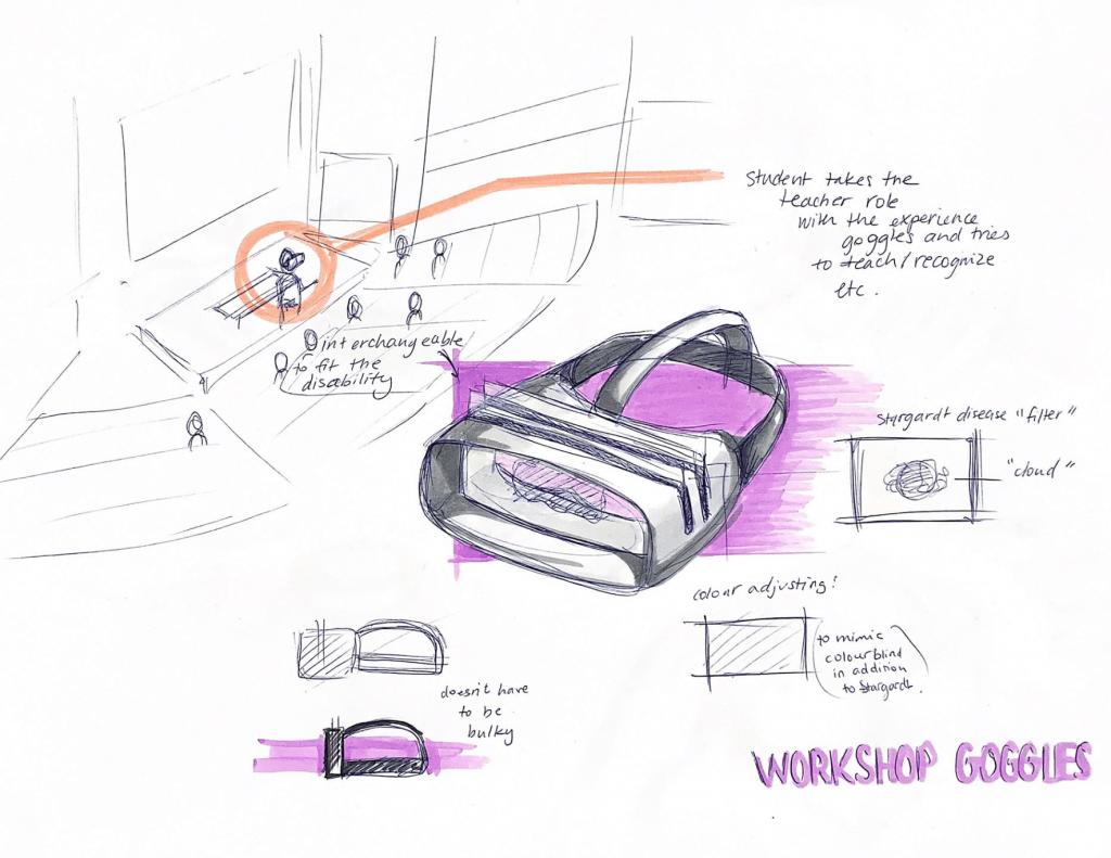
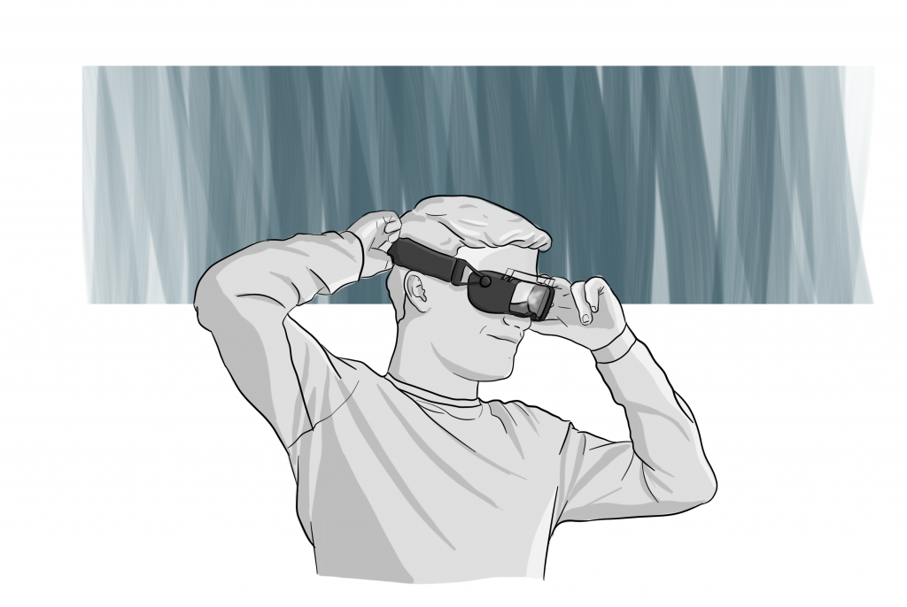
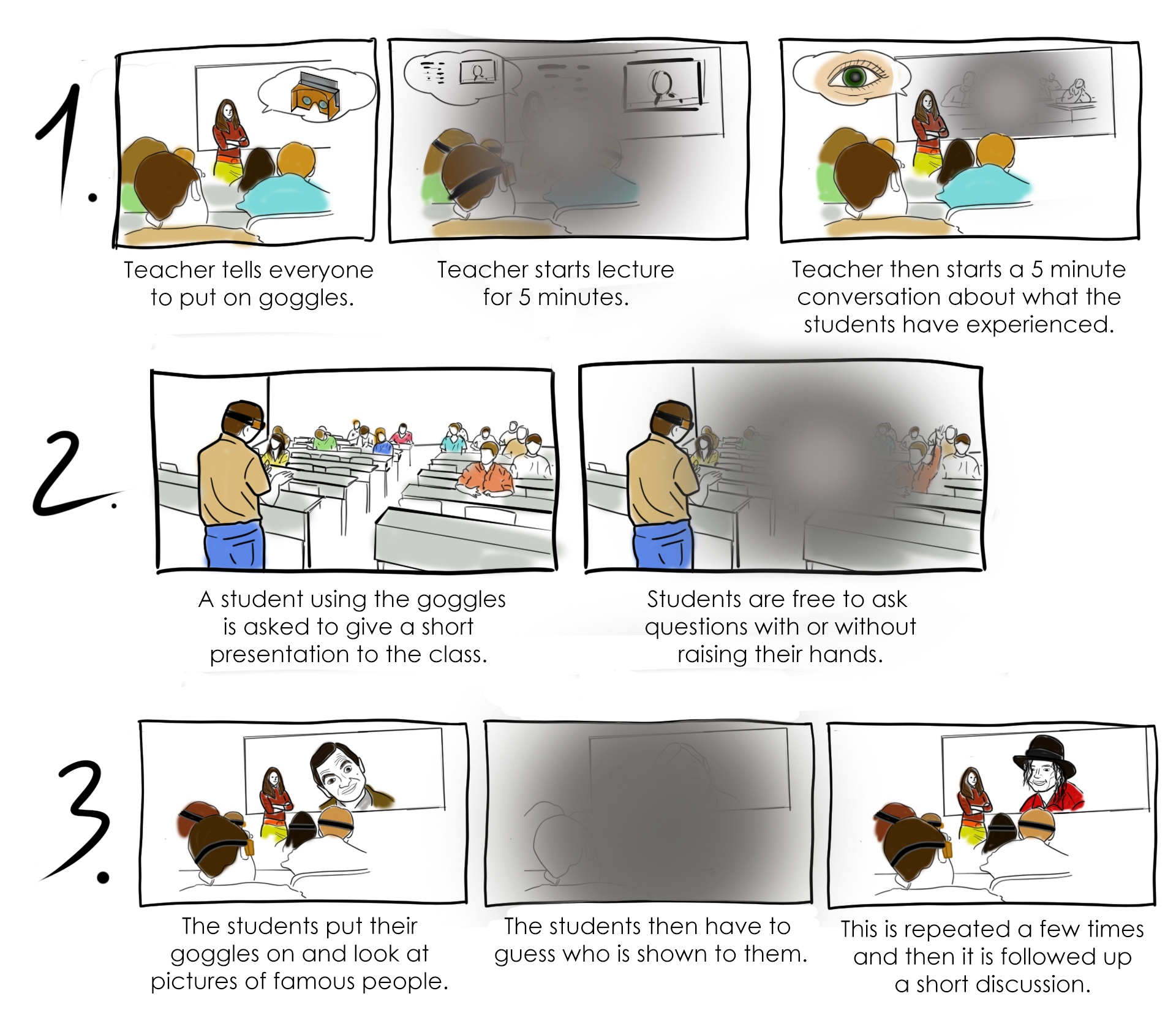
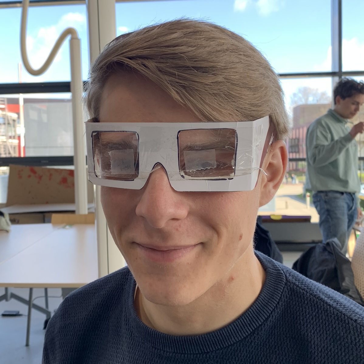
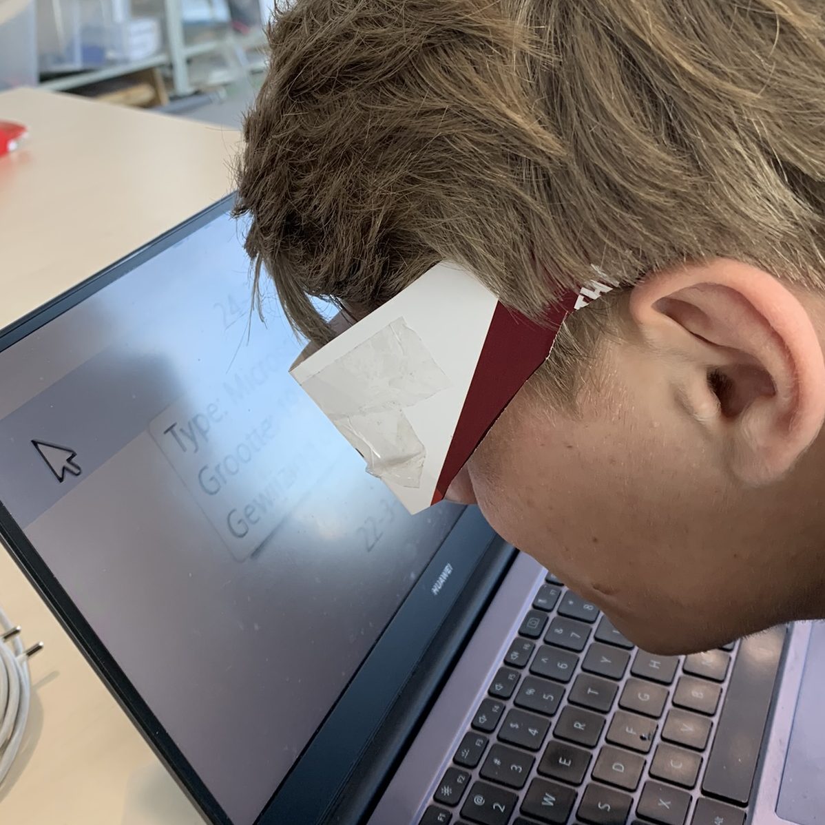
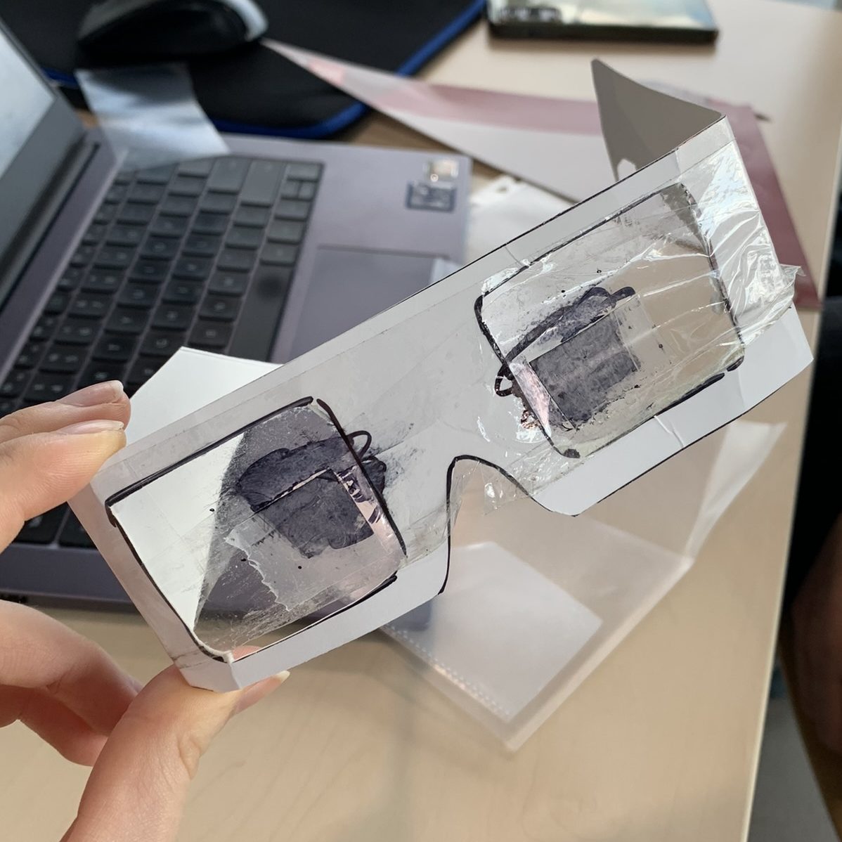
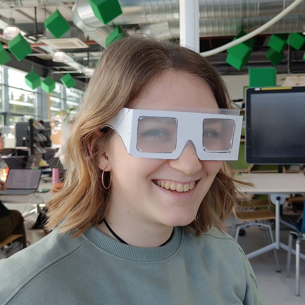
This concept presents a workshop at the beginning of a new class. This workshop will let the students do certain tasks with VR glasses on. For example:
This workshop was designed to allow the students to empathise with their teacher and solve the teacher problem from the student’s perspective. This idea came after our first meeting with the case owners, after they explained a scenario where they would like the student’s names. They explained that they ask the students to say their name before they talk, but the students forget about it and do not keep on doing it. Instead of designing a product towards the teacher, this idea looks at the problem from another perspective.
The deliverables will be a workshop plan and a box with all the tools necessary.
To the students that cannot attend the workshop, the plan is to create a website with interactive games and experiences where students can still get a feeling about Stargardt disease and the teacher’s experience.
This section introduces the Co-Design session and its results. Bellow, you an find the notes of the meeting of the Co-Design session.
The Co-Design meeting was online therefore we were limited to purely using auditory methods.
However, due to the video call we could look at the physical reactions they had to certain ideas and concepts. Body language is a powerful tool as people are less likely to completely speak their mind if they dislike the concept. In the first meeting it was clear that they thought of using AI face recognition of some sorts as a concept.
To manage the expectations, we started the second meeting off by explaining that using AI is not in our scope of possibilities and would result in a conceptual solution. After guiding them with a few boundaries we asked them to explain what they would see as a solution. Looking at the body language, we noticed that they were enthusiastic regardless and elaborated on two different solutions they would see fit.
While they were coming up with solutions we tried to stimulate them by mentioning keywords. (For example, by mentioning a button and seeing what they would think of). This guiding method is a way of achieving a concept which is fitting for both parties involved.
After them explaining what they would find a fitting solution the three different concepts that were previously mentioned were explained. After each concept they gave their opinion and feedback. Due to this feedback we learned which aspects they found interesting and which we should further explore.
An important aspect to mention is the change in perspective that this session led to. The case owners switched from thinking that hiding their disability was the solution to turning the problem around and spreading awareness about their disability to the students.
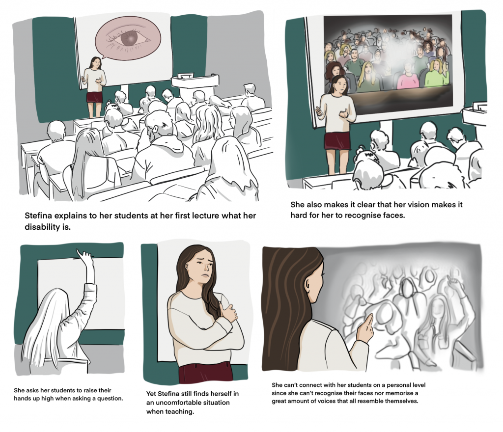
To learn about the specific context we were designing for we also investigated if it was possible to have a conversation with the students of the case owners to get a better understanding of their point of view. It was possible to attend a lecture by one of the case owners, after which we had the opportunity to ask the students questions. To make sure that the students would not behave in a different manner due to our presence we were not introduced beforehand. During the lecture the behaviour of the students regarding the visual impairment of the teacher was noted. After the lecture we had an open conversation with the students and asked what their experience was. The students had an active posture during the conversation and a clear image was sketched of their stance. The meeting resulted in the conclusion that the students think it is not so important for the teacher to know their name, but some found it interesting to receive more information about the visual impairment.
In conclusion, the Co-Design session helped us design our solution in collaboration with the case owners and broaden both our view on the solution and theirs. This concluded in a combination of two concepts: The Workshop followed by the App.
The design challenge is to design a method or product that can help the case owners connect with their students in a more personal way and raise the awareness of the students regarding the situation of the case owners.
After the co-design sessions with the case owners and the students it was decided to go with a combination of the app and the workshop. Meeting the students helped us understand that the app would not make it clear enough why the students should use it. Therefore, we decided to introduce it through a workshop which is meant to raise awareness about the disease of our case owners in hopes of giving the students more motivation to use the application.
Here is a short overview of the final concept:
The workshop will happen during the first couple lectures given by one of the case owners. The students will be put in the shoes of the case owners, and this will take approximately 15 minutes total. (3 activities of 5 minutes at 3 different classes.) The workshop raises awareness among the students, and hopefully this will affect their behavior towards their teacher. (say their name while they raise their hand). This will help the case owners a lot, since they will feel more connected with the students and the problem would be solved thanks to the students’ initiative.
The reasoning behind the 3 mini-activities rather than one big workshop was guided by the student’s feedback. They expressed little interest in “wasting” their lecture time to gain knowledge on their teacher’s point of view. In this way, it is informative, does not take too long off of the lecture time and allows the students to get to know the teacher’s visual impairment.
The app has 3 main purposes:
The workshop is separated into 3 activities :
General feel: The students are asked to put on the glasses without context and wear them during the first 2 minutes of their lecture. Then, the students take the glasses off and discuss with their teacher what they experienced.
The student is the teacher: The class is be divided into four groups. Two groups will face each other and one group (the ‘teachers’) needs to try to recognize the other group (the ‘students’). The students raise their hand one by one and the teacher group tries to recognize them. The two groups switch and after 5 minutes, everyone discusses the experience again.
For the last activity, students already know the feeling and know that they cannot recognize each other. Therefore, everyone will put on glasses and try to recognize celebrities and famous characters shown in big on the screen. (mimic the magnifier x600) This results in a positive and fun outcome of the workshop and allows the students to remember the “filter” that mimics their teacher’s vision.
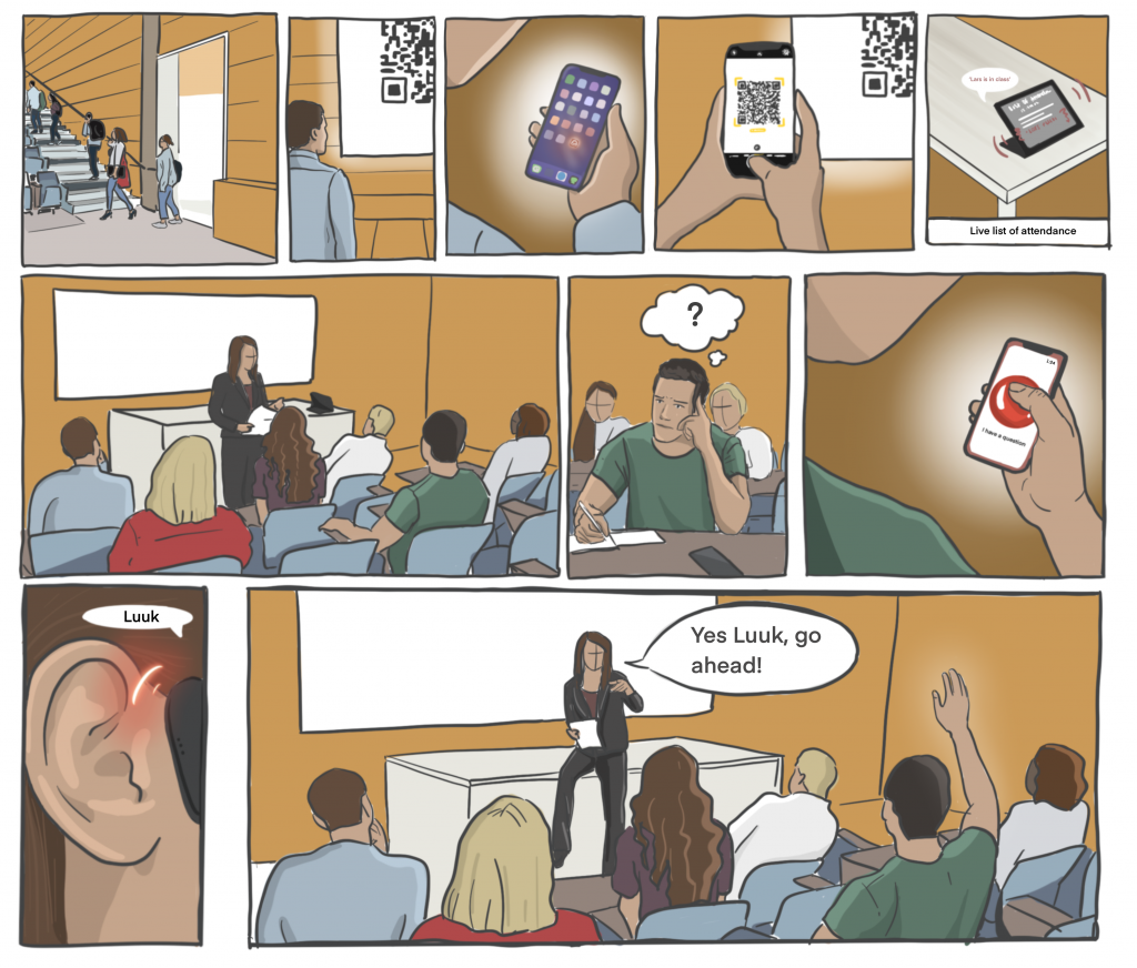
On the right, you can find the application storyboard. This gives you an impression of what the application does through a scenario where Luuk has a question and presses the button.
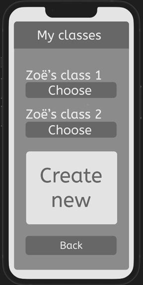
View for colour blind people
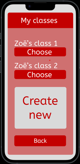
Normal view
As explained in the concept part, the app is designed for both the case owners and the students. Considering that the case owners have Stargardt disease, they don’t see clearly with the centre of their eyes and are colour blind. These are things that we kept in mind when designing the teacher part of the app.
We did research about app interfaces for visually impaired people and the most important insights were what the case owners also already mentioned. The buttons for the case owners are made bigger and we made sure that there is a high contrast in the app, so it is clearer for the case owners. In the pictures the ‘normal’ view of the app can be seen and the view for someone who is colour blind.
For the students, a smaller font size is used and smaller buttons are used. This is done, because they are not visually impaired and can read the text normal font size. In the pictures the comparison between the teacher/case owner login page and the login page for the students can be seen. As shown in the picture, the main difference is the login button.
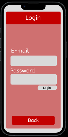
Student login page
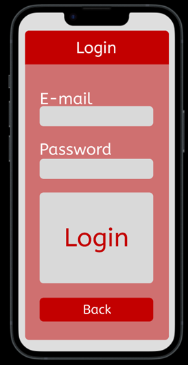
Teacher/case owner login page

After we had tested the app with the students, we also tested the app with one of the case owners. During the testing of the app with one of the case owners, she mentioned some things that she would like to have changed. The things we changed for the app based on the feedback of the students and case owners are: